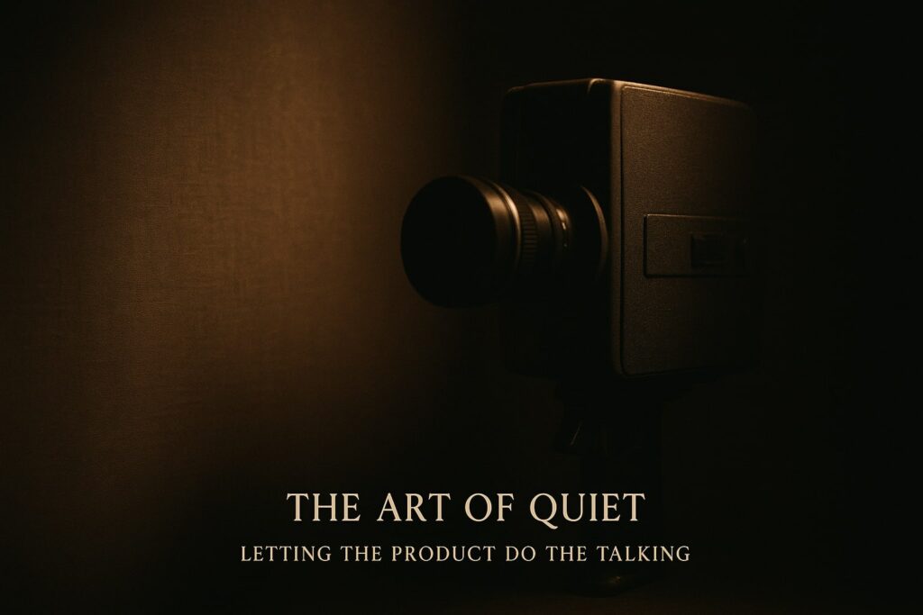
What “Quiet” Really Means
A craft-centric film doesn’t shout about the product, it whispers. It lingers on the details, tunes into tiny sounds, and trusts the viewer to notice. Think less voice-over, more close-up. The goal? Let the product tell its own story through process, texture, and mood.
In short: silent storytelling that lets visuals do the heavy lifting.
Why Quiet Works (and Why Your Audience Will Thank You)
Let’s be honest, people are tired of flashy, over-the-top ads. A pared-back, “quiet” film breaks through that noise. Those small tactile details-the grain of wood, the click of a button, the rhythm of a maker’s hands-stick in memory faster than any list of specs ever could.
Minimalism isn’t just aesthetic; it’s effective storytelling that engages both mind and senses.
(See: Advids’ take on product storytelling.)
How to make a craft film that actually sells
Keep these levers tight:
Close-frame the craft. Micro-details are your hero shots. Less context, more texture. See BluestonePIM’s tips for “boring” products. Product centric video production thrives on this.
Use sound like punctuation. The click of a cap, the thrum of a motor recorded well, these are emotional hooks.
Pace like a human breathes. Hold the frame. Let the viewer inhale the scene. Minimal cuts let tactile moments land.
Bring UX into the film. If the product is digital, show interactions; if physical, show user touchpoints. Placeit’s minimalist video examples are instructive.
Go documentary, not demo. Use actual people, not actors, authenticity matters in craft centric films.
films worth bookmarking
MINI-Minimalism case study (Design-led car film; quiet design details).
Royal Enfield – “Home” : a cinematic ride that prioritises place, and human hands over hard selling.
Mia by Tanishq – “India Makes Us” : jewellery crafted and communicated through hands and light.
Who this style suits and who it doesn’t
Retro-futurism gives you permission to be both comforting and audacious. It’s a way to say “we remember where we came from” while pointing to where you’re headed. But like all unique brand design concepts, it only works when it’s right for the category, the audience, and the message. If you’re designing a digital first brand identity that needs to land emotionally and move fast, this is a trend worth trying carefully.
Final thoughts
Quiet brand films and minimalist advertising films don’t whisper because they’re shy; they whisper because they know you’ll lean in.
Done with the art of visual storytelling, minimalistic brand films, and films that let the product speak, these productions turn every small detail into a moment of persuasion.
With careful craft centric film production and attention to silent storytelling in branding, you transform simple processes into a narrative that sells, letting your product take center stage, naturally.