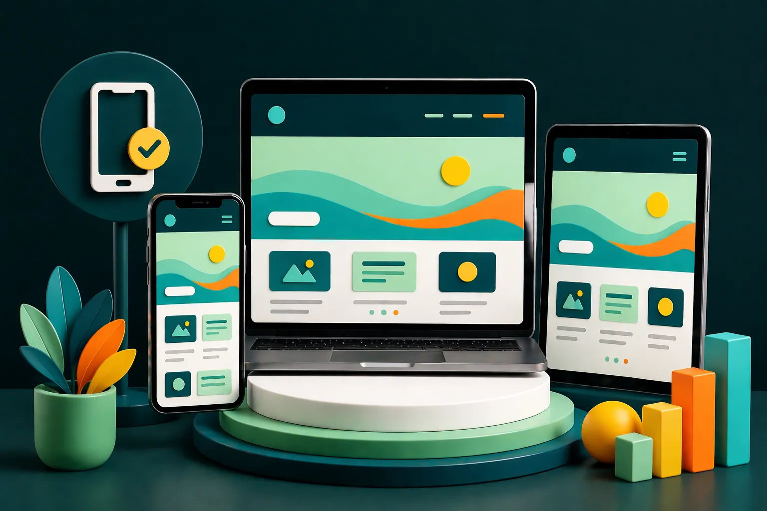
You know that moment when you’re curled up on the couch, dog on your lap, tea in hand, and you decide to finally buy that pair of shoes you’ve been eyeing for weeks? You open the link… and BAM. The website loads in desktop mode. On your phone. Tiny buttons, overlapping text, and a checkout process so confusing it feels like filing taxes.
Friday, our office dog, looked genuinely concerned as I rage-scrolled with one hand and spilled chai with the other. That’s when it hit me—if your website can’t handle something as basic as responsive web design, you’re not just losing sales. You’re losing trust.
In 2025, mobile-friendly website design isn’t up for debate. It’s the bare minimum.
The Mobile Takeover (and Why It’s a Big Deal)
People don’t “go online” anymore. They live online. And they do it from their phones. Whether they’re checking prices in a cab, comparing brands in a store, or stalking their ex’s new skincare routine, your website better look good and work better.
A mobile-friendly website design ensures that your customer journey isn’t an obstacle course. It should feel like a seamless conversation—not a tech tutorial.
Example: Nykaa
Their mobile-first design doesn’t just sell beauty—it feels beautiful. Filters, reviews, swipe-to-shop—it’s as intuitive as putting on lip balm.
Why Responsive Design Matters (and Why Ignoring It Is a Crime)
Imagine walking into a store and the shelves are upside down, the lights flicker, and no one speaks your language. That’s what a badly built website feels like on mobile.
Responsive e-commerce website design isn’t just a flex—it’s a function.
Why responsive design matters:
- Google rewards it. (Yes, SEO matters.)
- Users expect it.
- Your revenue depends on it.
Example: Lenskart
From virtual try-ons to a cart that doesn’t mysteriously empty itself, Lenskart’s mobile site is a case study in user-friendly website design done right.
Benefits of Mobile-First Design: Clean, Clear, Clickable
Designing for mobile first makes you prioritize what matters:
- Load speed (because no one has 7 seconds anymore)
- Scannable content
- Thumb-friendly design
- CTA buttons that don’t hide under carousels
Benefits of mobile-first design go beyond aesthetics—they improve user experience and web design, boost conversion, and reduce bounce like a dream mattress.
Good UX: The Difference Between a Visitor and a Customer
User experience in web design isn’t about colors and curves. It’s about clarity.
Want to convert website visitors into customers? Make it ridiculously easy for them to:
- Find what they need
- Know what to do next
- Trust that their money is safe with you
Example: Swiggy
Their mobile site is so smooth, I accidentally ordered food while researching this article. Twice. That’s what high-converting website design looks like.
Websites with Good UX Design: The Unsung Sales Reps
We love a charismatic sales team, but here’s the truth—your digital brand presence is your real first impression. And your website? It’s the front desk, showroom, and checkout counter rolled into one.
Websites with the best UX don’t make you think. They make you act.
Example: Cult.fit
From workout booking to gear shopping, their mobile design is so intuitive, you’ll finish leg day before you find a single glitch.
Website Design for Mobile Devices: A Must-Have Checklist
Your dev team should be thinking about:
- Adaptive grids
- Font legibility
- Visual hierarchy
- Button placement for thumbs, not mice
- Fast load time even on flaky 4G
And if they’re not? Time for a conversation. Maybe even a break-up.
Example: Tata 1mg
Whether you’re ordering meds or checking symptoms, their mobile site is reliable, fast, and fuss-free. A+ in mobile responsive web development.
In Short
Building websites in 2025 without responsive web design is like designing umbrellas that don’t work in rain.
If you want to turn visitors into customers, your mobile experience has to work flawlessly. A good desktop site isn’t enough—it’s got to be a user-friendly website design that adapts, delights, and sells.
Whether you’re in fashion, food, fitness or pharma—responsive web design, mobile-first thinking, and good user experience websites are the only way forward.
Because let’s be honest—Friday’s already judging your site’s bounce rate. And she doesn’t even have thumbs.