FlairGlass approached narrative, a branding agency based in Bangalore, to redefine and elevate its brand identity. They wanted to emphasise their commitment to quality, sustainability, and sophistication. FlairGlass stands as a testament to the enduring allure and versatility of glass, embodying its timeless appeal and eco-friendly attributes.
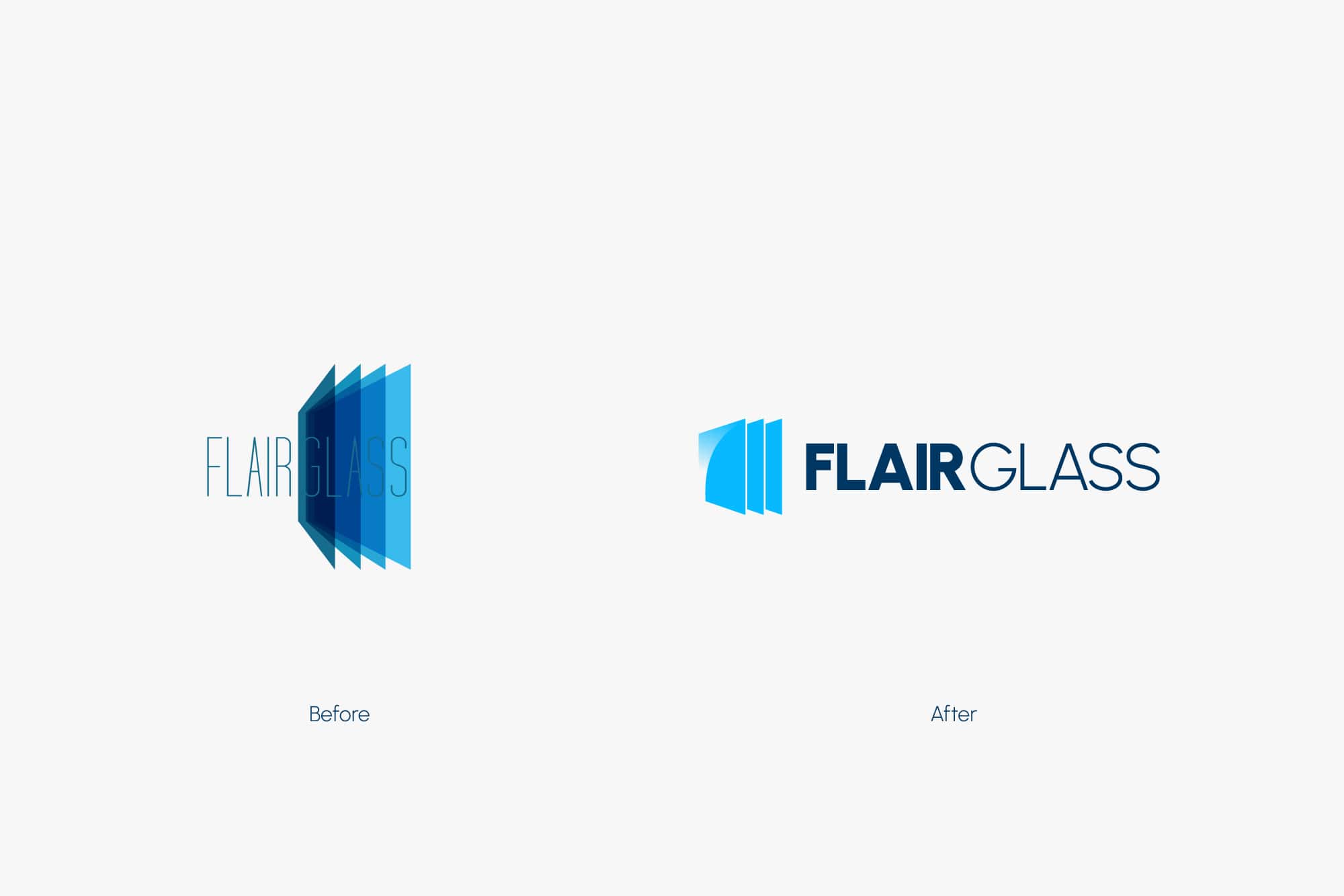
In crafting the brand’s visual identity, as a branding agency we meticulously designed a logomark that symbolizes the essence of Flair Glass, with each layer representing a distinct facet of its brand values.
The choice of the “Urbanist” font adds a contemporary touch while retaining a sense of authenticity and reliability, perfectly complementing FlairGlass’s ethos. Through thoughtful design and strategic branding, we aimed to communicate FlairGlass’s unparalleled dedication to craftsmanship and excellence in every glass product it offers.
Branding
Creating a memorable brand identity is essential for standing out in today’s market.Communication & Campaigns
Creating a unique brand identity is essential for a lasting impression.Web Design & Development
Stunning web designs & seamless development enhance your brand’s presence.Brand Films
Brand films & materials convey a business’s story & values, creating emotional connections.


