5 outstanding examples for inspiration
“Design is so simple. That’s why it is so complicated” quoted one of the twentieth century’s iconic and influential graphic designers, Paul Rand.
Well, isn’t that true? One cannot just slap colors, logos, and elements and call it a design. According to a study, 45% of customers expect a high-end design across all marketing channels. People enjoy beautiful things, so for a brand to connect, it should be visually pleasing and easy to remember. Visuals of a brand include:
- Logo
- Color Pallet
- Imagery
- Font
- Signage
- Packaging
- Icons, button
- Business Cards
- Flyers
Well, it is anything the customers see about your brand and 55% of a brand’s first impression is visuals! Therefore, it is important to develop a strong visual identity strategically.
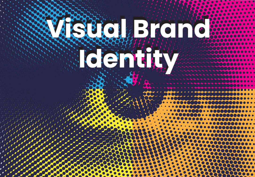
4 STEPS TO CREATE A STRONG VISUAL IDENTITY
- Consider the audience’s perception of your brand
This basically means developing a personality for your brand through colors, imagery, etc. For this, one needs to figure out the tone and character- is it quirky, professional, bold, elegant, or something else? This will not only help you in future campaigns and marketing but also help you stand out from the crowd. Your audience will also develop the intended perception of you.
Brand personality also includes brand story which is a powerful tool to evoke your audience’s emotions. Through a story, your audience will feel emotionally connected to you.
- Do a thorough competitor analysis
Learning about your competitors will give you a fair idea about what they are doing right (and wrong) and what you can do better to be spotted in the crowd. It is an important strategy for gathering intelligence and putting the information to use. There are direct competitors (businesses same as yours) and indirect competitors (businesses that are slightly different but satisfy the same audience as yours).
Also, a reference is essential for brand development and structuring your marketing. For example, you may discover a new set of audience or target the market in a totally different way. - Tailor your visual identity for different channels
Did you know that it takes just 7 seconds for customers to make an instant decision about whether they like your brand? Therefore, it is important you make those 7 seconds count by investing in the visual aspects of branding. While this is being considered, it is crucial to tailor visual identity strategically for different platforms and mediums.
The challenge lies in maintaining the essence of your brand while optimizing visuals for each specific context. This also ensures a cohesive brand image regardless of where they encounter your brand.
- Make a final analysis
Once all the brand assets are ready, you need to make sure it is cohesive, flexible- easy to grow and evolve over time, and of course, distinguished because you need to catch your audience’s eye.
Making a final analysis also helps one recognize missing elements (if there are any) and also ensures validation of the success in forging a memorable visual identity.
Once all the brand assets are ready, make sure they are going live consistently because this helps your audience remember you and it also makes an effective impact. This is backed up by research that says branding consistency can increase revenue by 20%.
If you need more clarity on how to craft a visual identity for your brand, here are 5 brands to get inspired from:
EXAMPLES OF GREAT VISUAL BRAND IDENTITY FOR INSPIRATION
1. BUMBLE
Bumble is a dating app that is available all across the globe and it is one of the first dating apps where only a woman can “make the first move”. Bumble sets itself apart by using a welcoming color scheme. Although one may feel they are adhering to the color of a beehive, it is more than that. Their colors create friendly vibes for the user and also create a sense of trustworthiness and positivity which is what people want from a dating app.


2. NETFLIX
Netflix undoubtedly has eye-catching visual branding. You can hear the sound “Tudum” in your head when you spot their logo anywhere. That’s how effectively they have implemented their visual strategy. As you can see, they have used a “less is more” strategy- a bright red logo with a black background. They believe that simplicity is the core of a positive user experience.


The colors black, white, and red also demonstrate the professional and passionate nature of the brand.
3. MCDONALD’S
McDonald’s is a classic example for fast food brands to get inspired. Regardless of the country, one can recognize the “golden arches” from miles away. Yet another brand that has taken a minimalistic approach- simple logo (M), bold colors yellow and red, and a catchy slogan (I’m Lovin’ It) that even a 3-year-old can recognize!

Did you know that the red color used by McDonald’s triggers hunger? Yes, that’s right! It stimulates appetite and makes you feel hungry. The bright yellow color is used for customers to recognize their store from far away.
Overall, it is branding done right!
4. FROOTI
One of India’s oldest and most loved juice brands. Although they rebranded recently, the juicy mangoes and the bright yellow packaging still remain the star of the show. Their classic 80s and 90s ads are still fondly remembered.


Their Instagram feed has a bright color pallet that includes yellow, purple, orange, and green which is visually appealing. They add real-life and turn it into miniature-sized which makes it humorous and unique!
Their page is worth checking out: https://www.instagram.com/mangofrooti_freshnjuicy/?hl=en
5. ZOMATO
Zomato, a restaurant review and food delivery app, has become the go-to app of almost every Indian. They are one of those apps that change their logo quite often. But how? This is because they can now simply afford to do it and their fortunes will not be affected.


They are present on every social media platform but differently. They used Facebook to post offers, Instagram for delicious food images, and X for tweeting one-liners (it is mostly moment marketing). They effortlessly connect with Indian audiences through their unique branding.
Ultimately, a successful visual identity not only resonates with your audience but also evolves with the dynamic landscape of your brand. Regular evaluation and adaptation contribute to a strong visual identity.
Remember to address the common pain points and dedicate a good amount of time while crafting a visual identity for your brand.